

Microinteractions: The Tiny Moments That Make Users Trust a Product
Good design closes the loop. Great design makes you glad it did.

Think about the last time you liked a photo on Instagram. You tapped the heart, it burst into red with a little bounce, and you moved on. The whole thing took less than a second, and you probably didn’t think about it at all.
That tiny animation wasn’t just decoration, but an intentionally designed interaction. It was doing two things at once: confirming that your action registered, and making the confirmation feel good. Most microinteractions only do the first part. The best ones manage both, and the difference between those two outcomes is what separates products that feel functional from products that feel alive.
The Job Microinteractions Were Built to Do
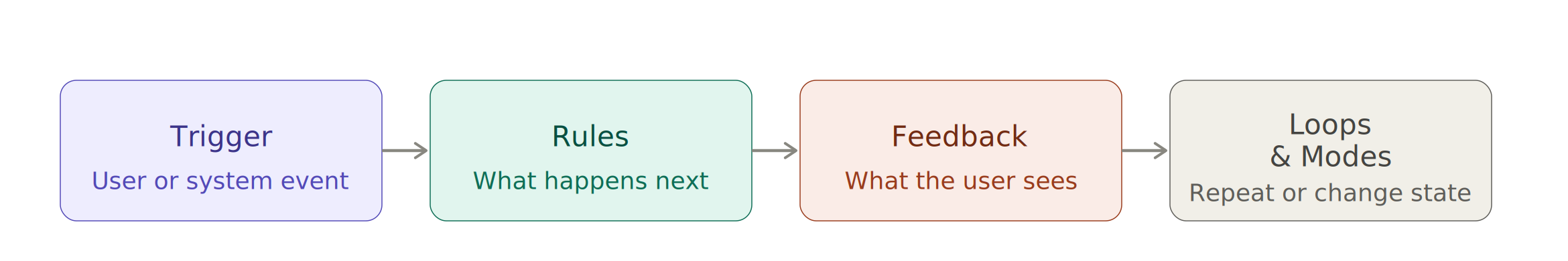
A microinteraction is a single-task interaction built around one contained moment, a tap, a toggle, a swipe, or a form submission. The concept was defined by product designer Dan Saffer, and at its core, it describes something simple: every action a user takes deserves a response from the system.
The reason this matters goes back to basic psychology. Our brains are prediction machines. We constantly scan our environment to understand cause and effect, and when we take an action and get no visible response, something feels off. Not dramatically wrong, just slightly unsettled. It’s the same feeling you get pressing a crosswalk button with a dead light, or submitting a form and staring at a screen that hasn’t changed. You find yourself asking: Did that actually work?
Microinteractions exist to answer that question before it forms. They close the feedback loop, the psychological mechanism that makes systems feel predictable and trustworthy. When the loop is open, users hesitate, second-guess, and sometimes abandon. When it’s closed, they move forward with confidence.
Feedback First, Always
The foundation of any microinteraction is feedback: some signal that the system heard you. This can be visual (a button changing color on press), auditory (the iOS “sent” whoosh when an email leaves your outbox), or haptic (the subtle vibration when you toggle a switch on your phone). Often, the most effective designs layer all three together, because redundancy ensures that even if one channel is missed, another catches it.

What’s easy to underestimate is how much the absence of feedback costs you. Research from Nielsen Norman Group shows that delays of even 100 milliseconds can disrupt a user’s sense of direct manipulation, that feeling that they are controlling the interface rather than waiting on it. The implication for designers is that feedback doesn’t just need to be present, it needs to be immediate. A spinner that appears half a second after a button press still creates doubt. A state change that happens the moment your finger lifts does not.
Progress and loading states are a particular place where designers can either earn trust or quietly lose it. A blank screen while content loads feels like nothing is happening. A skeleton screen (the placeholder layout that mimics incoming content) feels like the product is already at work on your behalf. The difference in actual load time is zero. The difference in perceived wait time is significant, because our brains interpret visible activity as progress, even when it’s only a representation.
The same logic applies to form validation, error states, and success confirmations. A "Message sent" banner that slides in after you submit a contact form isn't just a nice touch; it's closing a loop that would otherwise stay open. I’m sure you’ve had times where that confirmation was missing, and you’ve found yourself asking, “Did it work? “Do I need to resubmit?” That’s the cost of leaving the loop open.
Where Feedback Becomes Delight
Here’s where it gets more interesting. Once feedback is doing its job reliably, you have an opportunity to make it do something more: to make the interaction feel good, not just correct.
This is the realm of motion design and delight, and it’s one of the most misunderstood areas of product design. Delight doesn’t mean playful animations everywhere, or confetti cannons on every button press. It means using motion with intention, to communicate something that a static state change cannot.

Consider Duolingo’s correct answer animation. The green glow, the cheerful sound, the way the screen seems to briefly celebrate with you. Each of those elements is feedback in the technical sense (the system is confirming you got it right), but the animation goes further than acknowledgment. It creates a small emotional reward. Psychologists call this positive reinforcement, and it’s exactly what Duolingo is engineering: a conditioned association between getting an answer right and feeling good about it. It’s a deliberate design decision that keeps people coming back.
Or take the iOS rubber-band scroll effect, the way the screen stretches and snaps back when you reach the edge of a page. It serves no functional purpose in the strict sense. Nothing new happens when you hit the bottom. But the elasticity communicates something important: you’ve reached a boundary, and the system is acknowledging it. Without that feedback, hitting the scroll limit feels abrupt and disorienting. With it, the interface feels physical, like something with real edges and weight.
What both examples share is that the animation isn’t just decorating a state change. It’s communicating a relationship between the user and the system. Duolingo’s animation says: We noticed what you did, and it mattered. The scroll effect says: you pushed against a limit, and the product pushed back. That kind of communication builds a subtle but cumulative sense of trust.
What This Means When You’re Designing
Every interaction in your product is a conversation between the user and the system. Microinteractions are the responses in that conversation, and how you respond shapes how the user feels about the relationship over time.
The baseline is always feedback: every action needs an acknowledgment. A button press without a state change is a question with no answer. A form submission without a confirmation is an email left on read. Once that baseline is solid, you have room to go further, to use motion not just as confirmation but as communication, as an emotional cue, as the thing that makes a product feel like it was designed by someone who cared about the experience of using it.
The best microinteractions are the ones users never consciously notice. They’re the reason an app feels smooth, but nobody can explain why. They’re the millisecond animations, the haptic nudges, the state changes that arrive before doubt has a chance to form. Get them right, and your product doesn’t just work. It feels like it’s on your side.